Offset Printing Design: The Importance of White Space
When doing graphic design for
offset printing, you can never underestimate the power of leveraging white space.
White space (sometimes called whitespace or negative space) is a specific type of graphic design element that is important for several reasons. When you use it wisely, white space helps to ensure that your offset printing — whether it’s a catalog, brochure, collateral or marketing piece — engages your target audience and conveys the message you want to get across.
Misuse it and your offset (or
digital) printing design may fall flat.
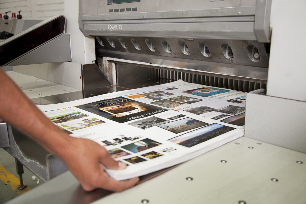
Understanding White Space in Offset Printing Design
When doing graphic design for offset or digital printing projects, white space is the “blank canvas” area between your text, images and other graphic elements. It isn’t always technically white, per se — it is sometimes the color of your background, whatever that may be.
Graphic design has two types of negative space, typically referred to as active and passive. Passive space is what you see between letters of text, for example. Active space is the important kind however, which is the negative space you intentionally build into your design.
Why You Need White Space in Your Offset Printing Design
The purpose of using negative space is to indicate to your audience what’s important and to direct their attention to what you want to highlight on the printed page.
In addition to being pleasing to the eye, this technique also makes your design more readable and improves the comprehension of the viewer. It gives the appearance of a more elegant and professional layout.
You can get a better idea of just how bad things can get when you ignore whitespace by perusing these examples of design gone wrong. Next, check out these examples of effective offset printing flyer designs.
You will notice that the one element these effective designs have in common is the liberal use of negative space.
Using White Space in Your Offset Printing
Any professional graphic designer will tell you that the main reason businesses tend to skimp on the negative space in their graphic design is that they try to say too much. This leads to filling every available centimeter on the page to push as much information out as possible.
You can avoid this trap by beginning your design plan with your call to action (CTA). What do you want the target audience to do after reading your flyer, brochure, etc.? Do you want them to call your office or visit your website? Do you want them to provide their contact information to you? Whatever your overarching objective is, start by positioning that element first, and then build around it.
If you aren’t used to incorporating negative space into your designs, try not to fight it. Other than the CTA, add in only those details that are imperative for your audience to have. Or if you truly need to pack your design with information and graphic elements, consider expanding your design to add additional pages.
At
Sun Print Solutions, we want to make sure that all your designs achieve their desired goals. Contact us today for any help you may need to achieve effective graphic design for your digital or offset printing jobs.


